Modal Unveils New Logo and Launches First Brand Campaign in San Francisco
- Gate
- Machine Learning
- Departs
- Crew
- Sona Dolasia
- Passengers
- 558
Modal has refreshed its logo and rolled out its first out-of-home campaign in San Francisco, promoting its AI infrastructure platform with targeted messaging.

Logo Evolution
Modal, established in 2021, has undergone a significant visual transformation as part of its branding strategy. While the company’s wordmark has evolved, the core element of its branding—the cube “M” logo—remained largely unchanged. This logo, characterized by its thin lines, has been integral to Modal’s identity and even inspired the creation of a company mascot named Moe & Dal. However, the limitations of the thin-lined design became pronounced, particularly when the logo was displayed in smaller formats. The challenge of maintaining visibility and clarity in various contexts is something many brands grapple with; this issue isn't unique to Modal. As Modal’s overall brand identity began to evolve, the logo started to appear less consistent with these changes, highlighting the sometimes forgotten impact of design consistency on audience perception.


The primary goal behind redesigning the logo was to enhance its adaptability across various applications, ensuring it retained its recognizability. Modal sought a logo that would represent a natural progression of the brand, harmonizing with the shifting visual identity needed to stay relevant in the fast-paced tech industry. This isn’t just about aesthetics; it’s about functional branding that communicates clarity and intent across platforms. As Modal grapples with these branding elements, it echoes a larger truth in marketing: a company’s visual identity must evolve alongside its mission and goals.
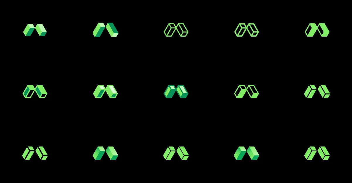
In collaboration with designer Ty Wilkins, Modal explored numerous design iterations before arriving at a refined logo and wordmark. The new visual representation maintains greater integrity across a range of contexts—whether viewed on favicons or larger formats like billboards. This adjustment in design philosophy emphasizes the importance of scalability. When a logo can successfully translate from digital screens to print media without losing its impact, it strengthens the brand’s overall imprint on consumers. In today’s fragmented media ecosystem, where audiences engage with brands across multiple touchpoints, such adaptability is becoming more critical.
Billboard Campaign in San Francisco
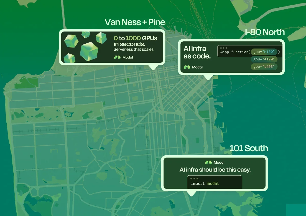
Coinciding with the logo refresh, Modal launched its first out-of-home (OOH) brand campaign targeting the tech hub of San Francisco. Given that Modal is based in New York City, this move aims to enhance its brand presence in a region recognized as a center for technology and artificial intelligence. The strategic choice of location emphasizes the brand’s ambition to grow in influential areas where tech innovation is paramount—something that tech startups often overlook.
The campaign's design reflects Modal's distinct brand identity while effectively communicating its core mission. After multiple iterations of copy, Modal chose three distinct billboard messages that highlight various facets of its platform, designed to position it as an accessible and scalable AI infrastructure solution. The messaging is crafted to resonate with tech-savvy audiences but also aims to educate those less familiar with the intricacies of AI technology. What this means for you, the consumer or potential client, is a direct offer of solution-oriented services framed in a way that’s both engaging and informative.


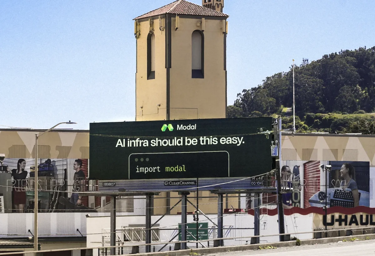
These billboards will be displayed in various strategic locations across San Francisco until the end of May. Modal encourages onlookers to share their sightings on social media, offering exclusive company merchandise as an incentive. This tactic merges traditional advertising with digital engagement—a clever approach in an age where social sharing can amplify a brand's visibility exponentially. (and this is the part most people overlook) The interplay of online and offline marketing activities is often underestimated in their potential to drive both engagement and sales.
Impact and Future Directions
The decision to revamp the logo and simultaneously launch an OOH campaign demonstrates Modal's commitment to strengthening its brand recognition in a competitive market. By shifting to a more versatile logo design, the company aims to prevent inconsistencies that can arise from varied applications. This is particularly significant for technology firms that operate in diverse contexts, including digital and physical spaces. Brands that fall short in this area frequently find themselves struggling to maintain a coherent identity, which can undermine customer trust.
As Modal continues to position itself in the AI infrastructure space, the company must assess the outcomes of this campaign in terms of brand awareness and customer engagement. The adaptability of the new logo could play a crucial role in how the brand is perceived across different media and audiences. Monitoring shifts in public perception, engagement metrics, and even social media interactions will be vital. A successful campaign will likely pave the way for other strategic branding efforts in the future, potentially expanding to include further digital campaigns or localized advertisements that build on this initial exposure.
That said, Modal’s branding efforts highlight the intersection of design and technology. They're about more than just aesthetics; they reflect a company’s values and mission in a heavily congested marketplace. With ongoing advancements in the AI sector, Modal will face increased competition, emphasizing the need for a strong and recognizable brand identity. As it navigates this dynamic, the responses to tangible updates like the new logo and advertisements will be essential in refining its marketing approach. The feedback loop created by consumer interaction—good or bad—will shape subsequent strategies, making it necessary for the brand to stay agile.
Modal’s initiative not only reflects current branding trends focusing on digital adaptability. It emphasizes the importance of aligning a visual identity with core business principles and market positioning. It's a playbook for other emerging tech companies aiming to carve out their niche in an industry defined by rapid change and heavy competition.